Maurann Stein
1st place @ Design & Hack Hackathon
Exquisite Corpse
A nod to a technique invented by the surrealists, Exquisite Corpse is a collaborative game app designed for 3-8 players who are not afraid to be silly.
The game
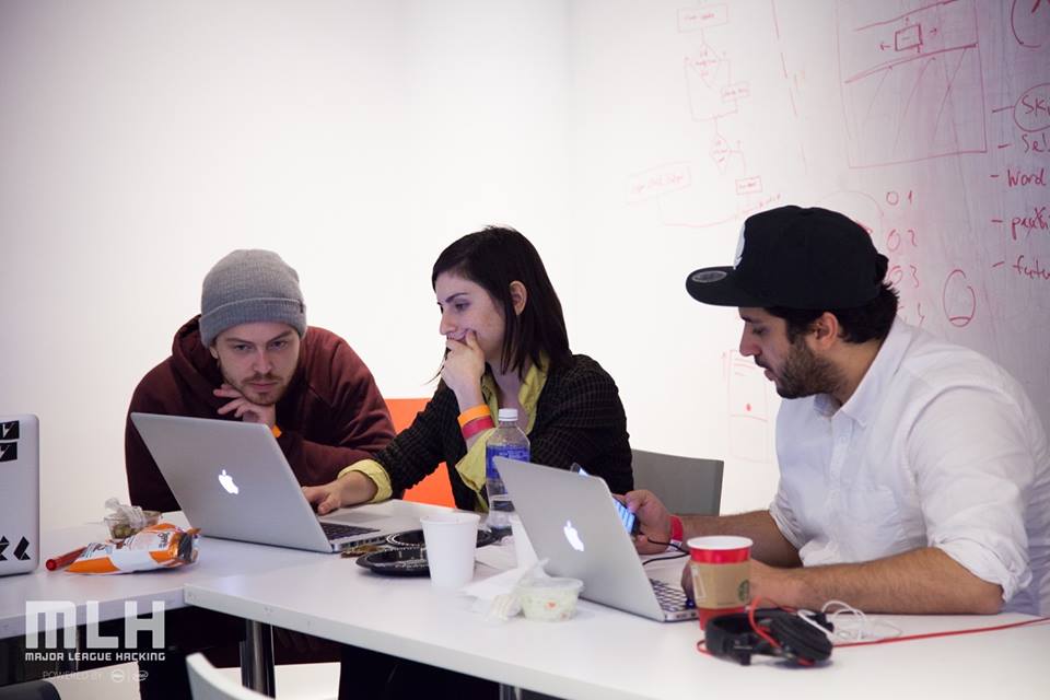
The idea to this app was born at Parsons’ Design & Hack hackathon, when Feras, Mark and I met each other and decided that we want to work on something fun. We spent the first few hours at the hackathon thinking, talking, getting to know eachother. When we felt more comfortable being silly together (and tired) our conversation reminded me of a game I used to play as a child. I explained Exquisite Corpse to them as I knew it in text form (apparently many people know its drawing version) and we played it just for laughs. Soon many people from other teams saw us laughing and asked if they could join us and play. It turned into a group of about 8 people playing this game together and laughing like kids. In a way, we conducted our first user testing before we even knew it.
To readers who don’t know Exquisite Corpse, I found a great explanation of it on Poets.org:
“Exquisite Corpse is a collaborative poetry game that traces its roots to the Parisian Surrealist Movement. Exquisite Corpse is played by several people, each of whom writes a word on a sheet of paper, folds the paper to conceal it, and passes it on to the next player for his or her contribution. […] The only hard and fast rule of Exquisite Corpse is that each participant is unaware of what the others have written, thus producing a surprising—sometimes absurd—yet often beautiful poem. Exquisite Corpse is a great way to collaborate with other poets, and to free oneself from imaginative constraints or habits. Remember, many of the most effective phrases or metaphors are those that are most surprising.”
Analyzing the flow
We tried to define what it is that makes this game so fun and amusing to us, and came to the conclusion that it’s the anticipation to unfold the paper and to reveal unexpected marriages between thoughts, ideas, words. We decided that the interaction of folding the paper in the physical game and the magical experience of unfolding it at the end were worth exploring in an app form, and we quickly began sketching out flows together.
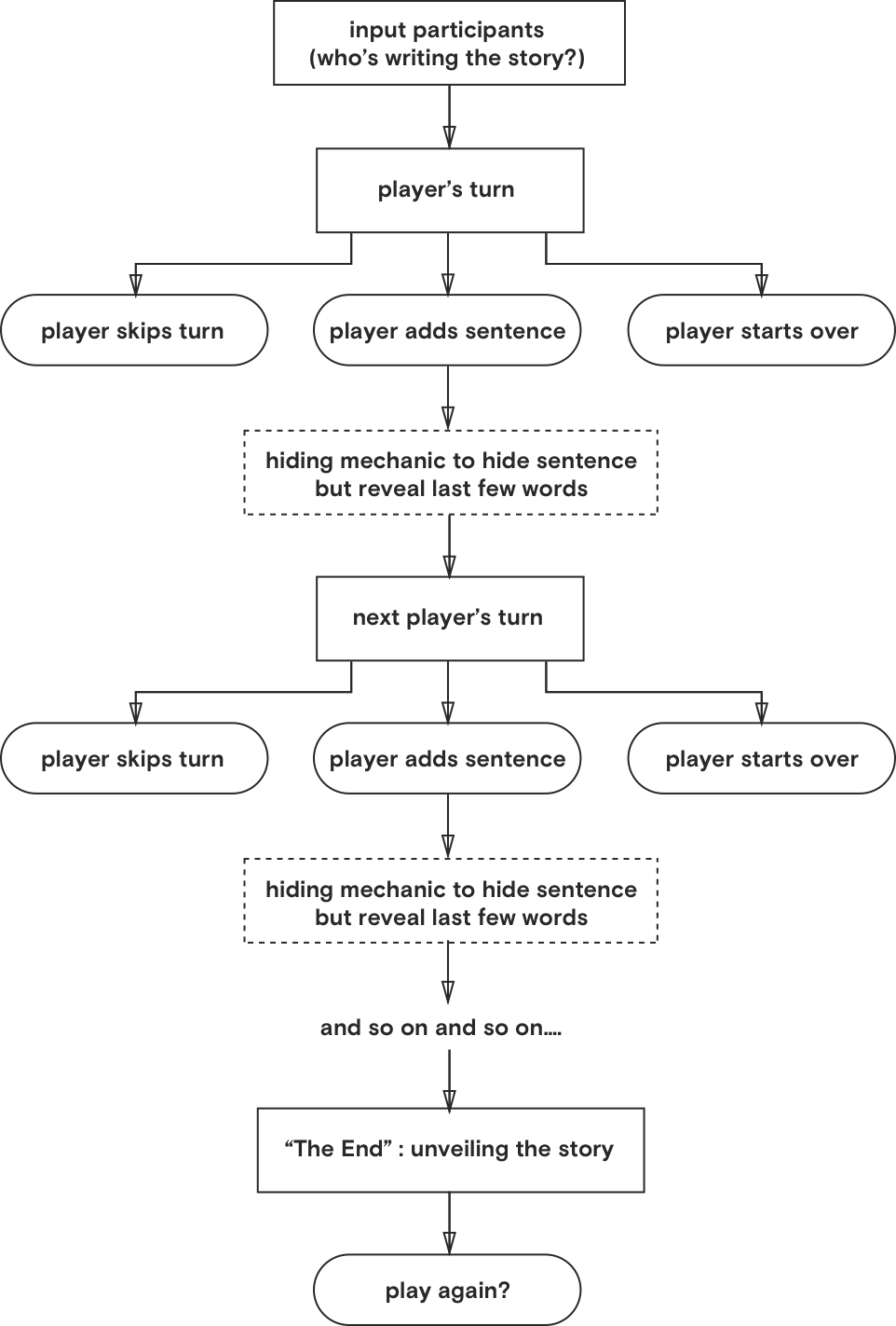
The flow on the left demonstrates our very initial response when we tried to translate the physical game into digital/interactive form. The rectangles represent key pages, the rounded rectangles represent moments where users are asked to make a decision, and the dotted rectangles represent animations.
New experiences
We realized we must figure out how to introduce magic to the game, and we finally came up with a few basic mechanisms to add to the experience:


Typography & color
In our game, the typography is playing a key role since there is no use of imagery altogether. It was important for us to make sure we are communicating our ideas and agenda through the type treatment.
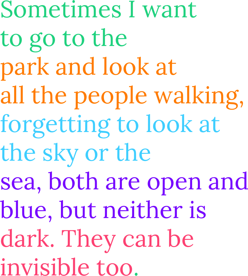
We chose Lora Regular as the primary typeface for all the narrative-text because of its serifs, its delicacy and legibility. We aimed give the players a sense of storytelling, as if they were collaboratively writing a story - but with some spice. We set Lora big to increase legibility (maybe people want to play this game tipsy in a bar?), and in varying vibrant colors between players.
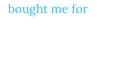
Due to technical reasons, we wanted to avoid a situation where players add their text on the same line as the former player. So we set up the type in a way that lets only 3-5 words take up each line of text. This solution allows a smoother transition between players’ turns, as the page scrolles up to reveal only the last line of text with the cursor ready on the next.
To differenciate the game-narrative from the rest of the text (instructions, messages etc.) we used Roboto, smaller and in black.
“The End”
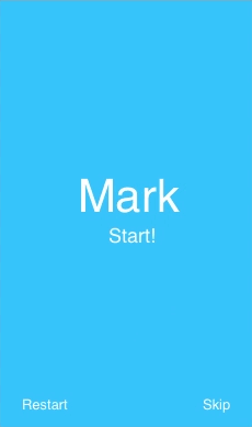
We wanted to create a delightful and special moment at the very end, right before revealing the entire story. So we came up with a very sweet animation in which the last player's timer shrinks down (or in this exampe's case when a player decides to terminate the game - the background shrinks down) and animates into the period at the end of the last sentence.
Coming up with a logo
The logo was one of our last-minute touches. I like its simplicity and how it reflects the intrinsic mechanism of the game: every new textual addition players contribute to the story is visually paralleled to a colored building block.
