Maurann Stein
Type design, 2015
Anti Alias Regular
A multi-platform investigation of low-resolution type when rendered on a high-resolution screen.
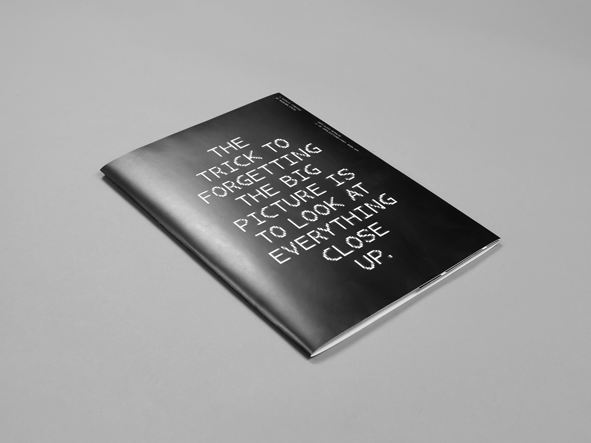
A short intro to monospaced type
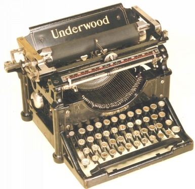
In 1829, William Austin Burt patented a machine called the “Typographer”, which was later referred to as the typewriter. Those early devices were not designed to create elegant layouts; they were just a way to get words on a page. Early (and cheap) typewrites could only move the same distance forward with each letter typed. This led to the necessity of monospaced typefaces: letters and characters that each occupy the same amount of horizontal space. Typefaces like Century Schoolbook, Courier and Letter Gothic were widely used at the time.
With the advent of the computer, the 80’s were the golden years of monospaced typography. 8×8 pixel mono-spaced fonts on low-resolution 8-bit home computer displays were in common use because of the computer's extremely limited graphical capabilities. The screen layout was addressed as a regular grid of tiles, each of which could be set to display a character by indexing into the hardware's character map. Some systems allowed colored text to be displayed by varying the foreground and background color for each tile, however these were typically limited to a single console font.
With time, technological advancements offered more memory availability and increased the graphical capabilities of computer displays. At this point, more typefces were digitized and were introduced to computers.
Anti aliasing
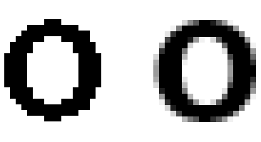
As computer’s graphical capabilities improved, designers and programmers developed methods trying to perfect the ways in which typography is rendered on screen. To minimize the difference between digitized and original typography, a software technique called anti-aliasing was invented, which diminishes “jagged” lines that should be smooth. These lines occur because the output device, the monitor or printer, doesn’t have a high enough resolution to represent a smooth line. Anti-aliasing reduces the prominence of stairstep-like lines by surrounding the stairsteps with shades of gray.
Six building blocks
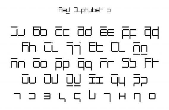
For my typographic experiment, I wanted to see what a blown-up anti-aliased type can look like when rendered on high resolution screens. I wanted to try to create a new displayface that celebrates the gap between print and digital by presenting the computational workarounds at the foreground.
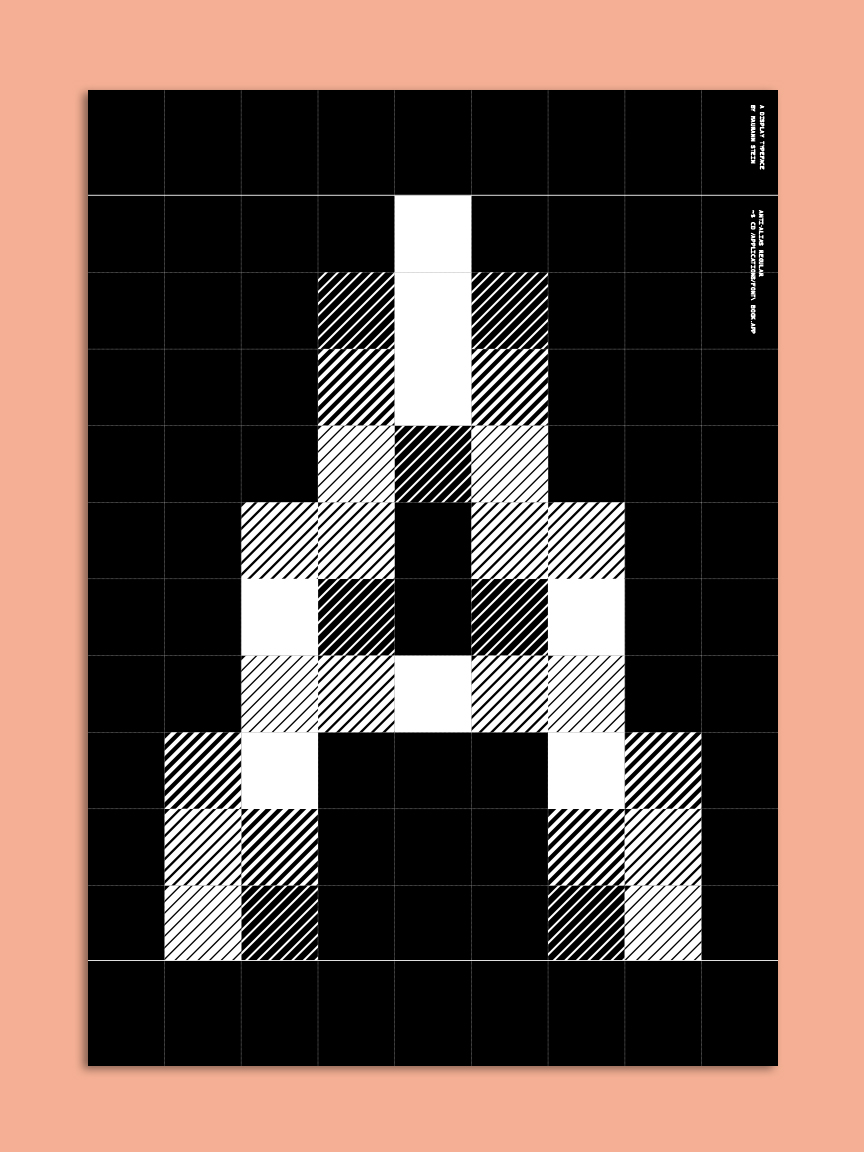
When I started to sketch, I realized that there is no way to construct typefaces with different opacities in font-design softwares (Fontlab / Robofont), and that led me to explore other creative alternatives. I came up with my own workaround to create varying opacities still using traditional glygh paths: the family’s building blocks are composed of diagonal lines varying in width and density; the thicker and more dense the lines are, the darker the area looks from a distance.

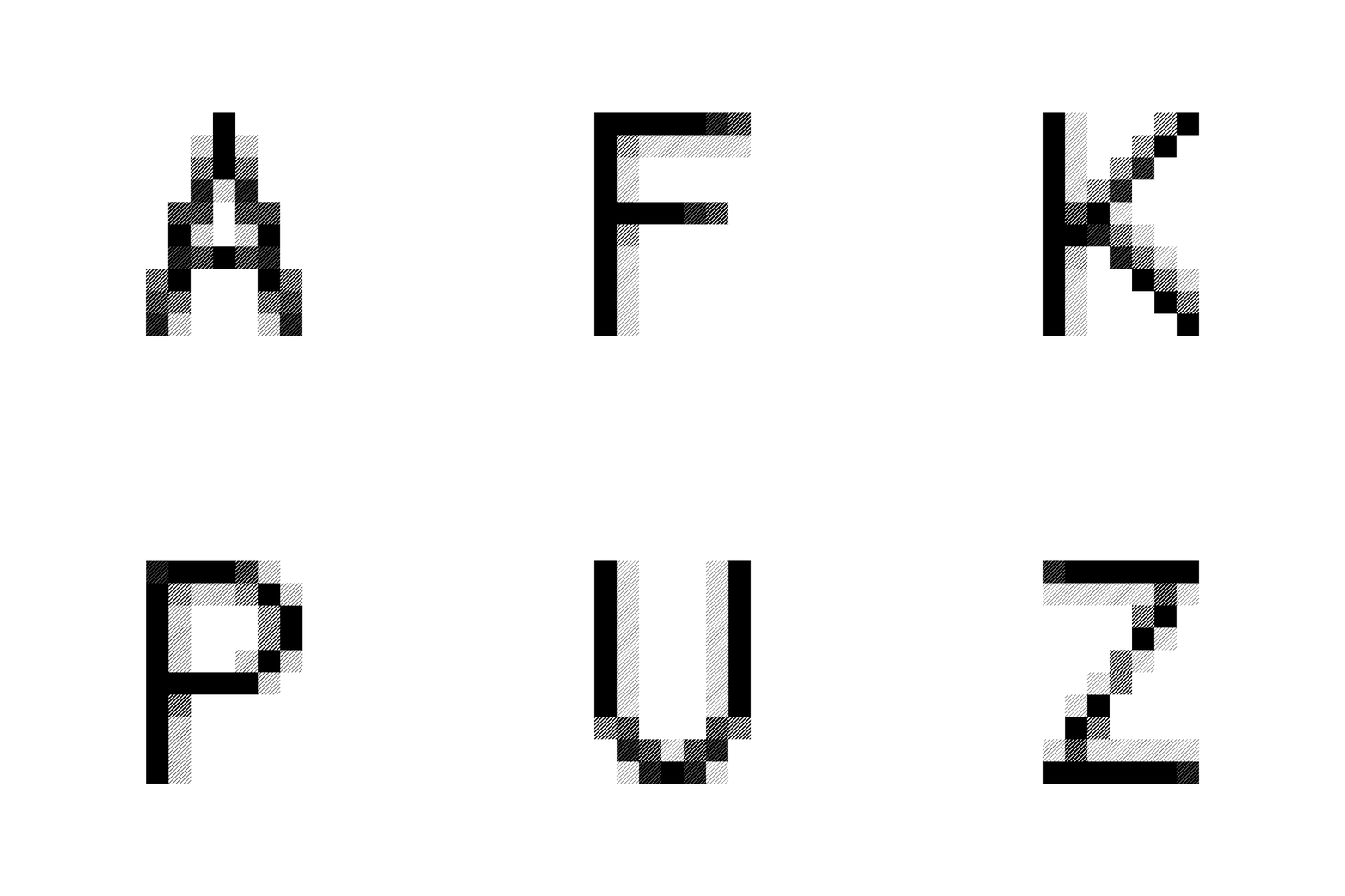
Type specimen poster
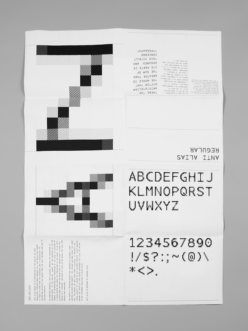
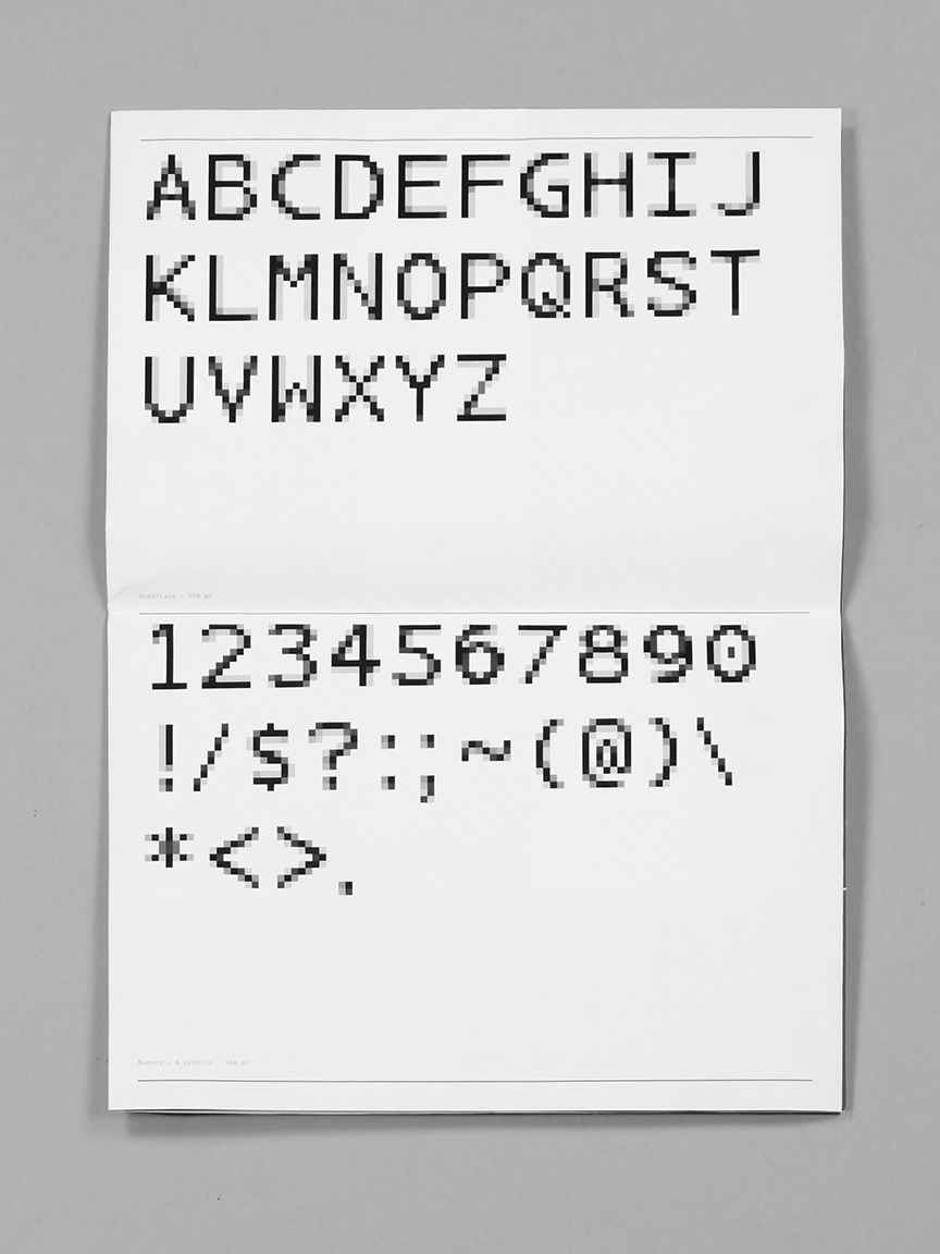
After I flushed out the Anti Alias glyph palette, I designed a double-sided type specimen poster enclosed in a folder: the front shows all of the Anti Alias charachters set in different sizes and the back shows a big, nocked-out letter A.
Front view:
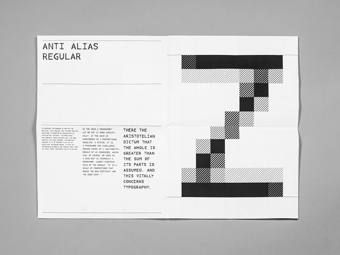
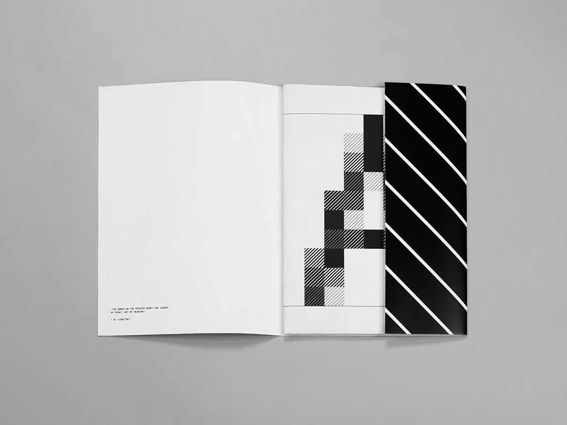
Back view:
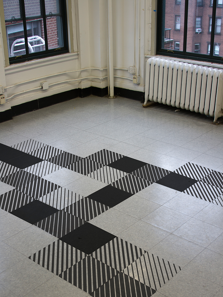
And then finally another little test, just for fun, to see how the type can work spacially and blown-up in a room (vinyl cut):
Type specien website
I then wanted to text my typeface on screen, so I designed a website for it. I wrote a simple algorithm that pulls nouns, verbs, adjectives and adverbs from buckets of words I came up with, and then joins them to create clumsy sentences with every click. The font-size changes according to the length of each sentence (the longer the sentence is, the smaller the charachters).