Maurann Stein
Helix, Jan—July 2017
Explaining genetics in 30 seconds
When designing the product detail pages for the myriad of products on Helix’s platform, I had to balance users’ need for efficiency and clarity of information with scalability and customization needed by Helix’s product partners.
Here’s how I did it:
The goals
By launch, the product detail page (PDP) must:
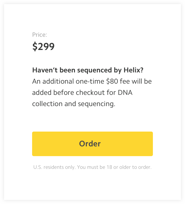
- Given the complexity around pricing, clearly communicate to users what they will be paying.
- Create a customizable template that supports how different partners present their products.
- Optimize for purchase funnel conversion.
- Maintain flexibility and custom content without sacrificing scalability and maintenance.
The non-goals
- Optimize for ease of publication and management.
- Build a robust internal tool to manage content or external portal for partners.
My role:
1. Knowing what we don’t know In order to redesign a new PDP, I wanted to first brainstorm with the team (a user researcher, a writer, and myself) and think about the old PDP we were about to change. We tossed some ideas and frustrations in the air, like how important real-estate on the page wasn’t utilized properly, or how the hierarchy of information was all over the place and people are confused about what they're getting. We knew certain things had to change based on feedback we got from our friends, peers and our guts, but we also realized that there are a few “unknowns” we were stepping into:
- We had super low traffic on our site at the time and most purchases were being made on the partner site—so the data we had already gathered from V1 wasn’t conclusive.
- The structure of the page only fit the product we were selling, so anything we say or critisize about the current PDP should be tested with other products first, and we didn’t know what they were.
- There was a new pricing model we had to explain (having to buy a kit for $80 just one time to get sequenced), and we didn’t know how people will respond to it.
It was time to do some research.
2. Studying customers’ comprehension We interviewed 13 people for 30 minutes in their homes and did a messaging exercise using four different positioning angles to evaluate words describing the Helix kit and ways to break down the prices:
We found that:
- When approaching consumers with our genetic product, consumers gravitated towards names like “Helix DNA kit”, “Helix DNA starter kit”, “Helix DNA bundle”.
- When describing what the Helix kit was and why a new customer would need it, people gravitated towards a more casual tone. We learned that any scientific or technical terms shouldn’t be our main ingredients, but instead should be used as supportive content to provide trust, legitimacy, and context—people did not wish to synthesize their shopping experience with a science lesson.
- A receipt-style price concept was preferred by most participants (we assumed sequencing/kit cost to be locked at $80 for this study)—it’s easy to scan with descriptions spanning a maximum 1-2 lines.
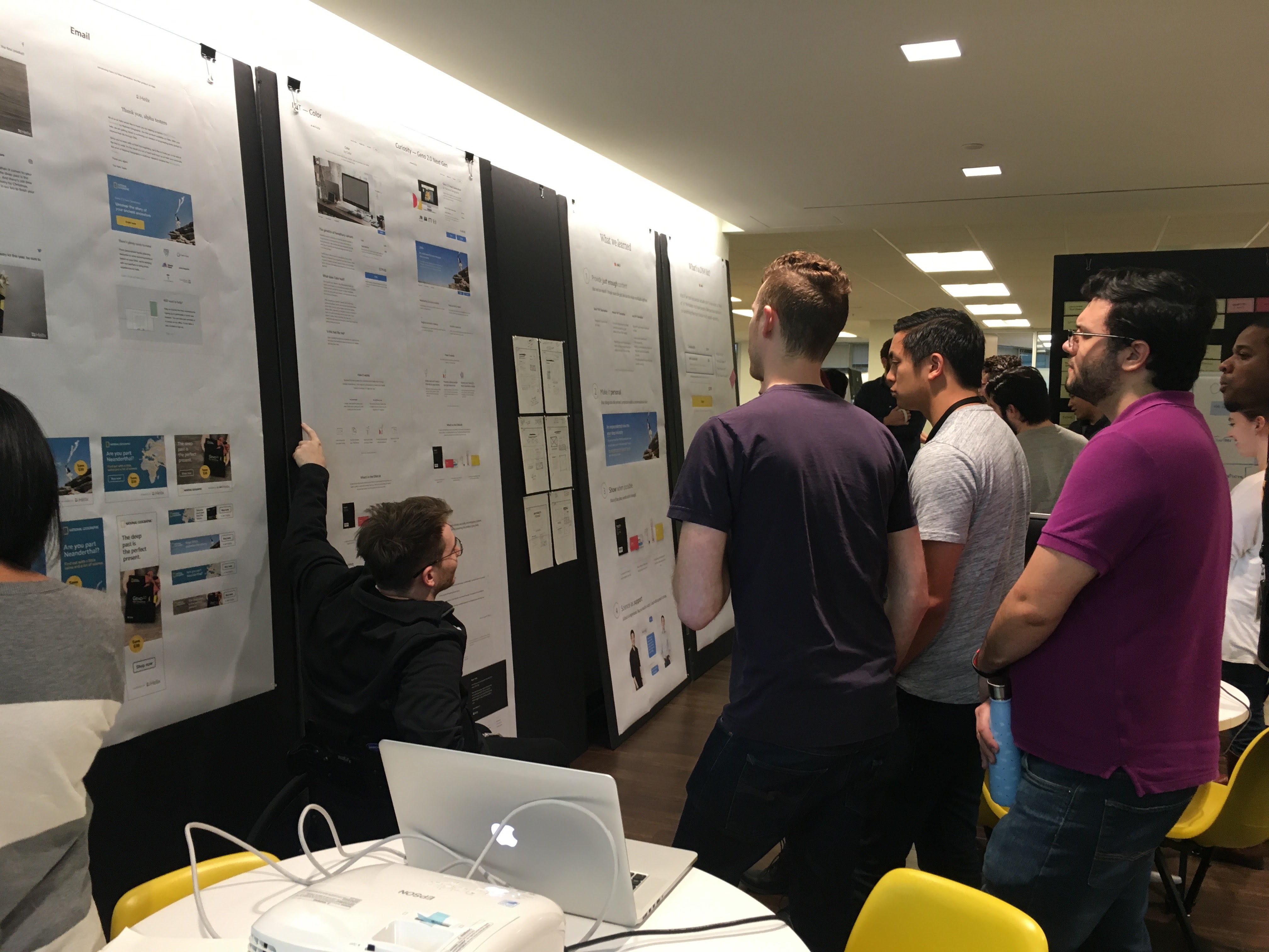
3. Principles, hierarchy workshop and initial sketches Our next step was to use our finding from the user studies to help us come up with our design principle for the project. We then sat down to define the hierarchy of information on this new PDP we were designing. At that point we had to make the destinction between two different types of products we knew were going to sell on the platform: one is an LDT (Lab Developed Test) product that in order to be purchased, the user has to fill out a brief questionnaire which is then sent to an online physician to approve. The other type is a “curiosity” product that anyone can purchase, anytime. Naturally, LDT products tend to be more serious—those are products that test your risk for developing some type of concerning diseases, which made us want to present the information on the page more slowly, thoughtfully, not leading with the price. We used are.na to collect ideas and precedents, and I started sketching.

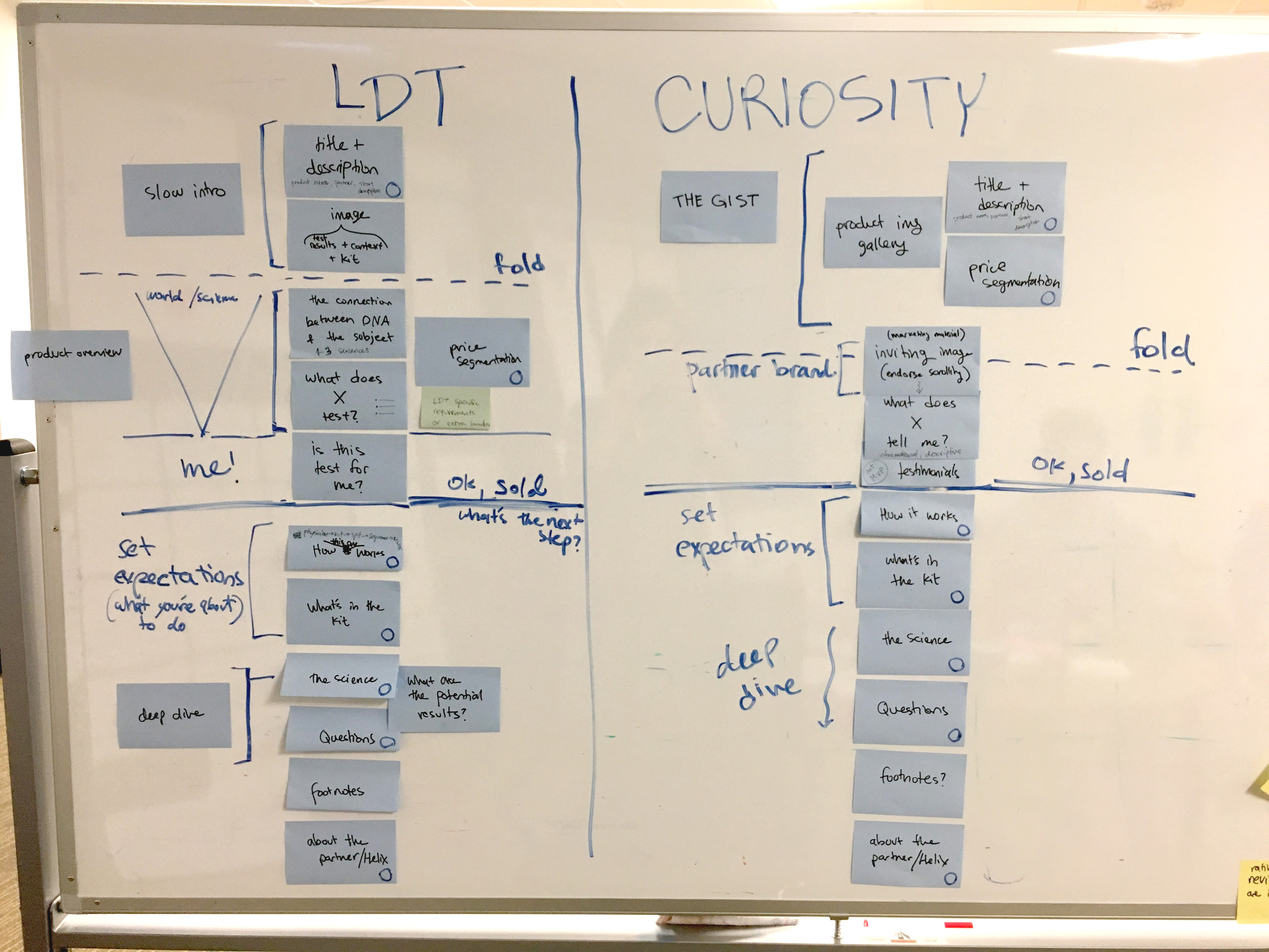
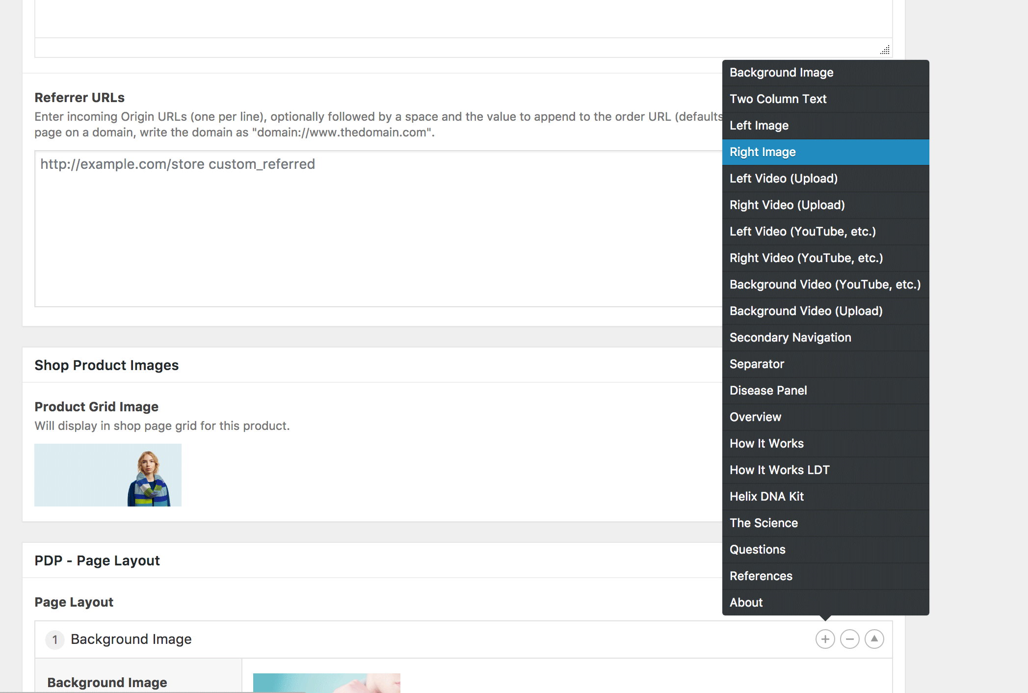
4. Not all products are equal. Reintroducing flexibility Genetics spans the spectrum of casual insights (like whether you’ll be bald or which type of wine you might like best), and serious insights (like your heart disease risk). I had to find a way to make the PDP flexible enough to allow partners to explain their products as best as they can while also minimizing Helix engineering effort to build the page. And, since we had to work with Wordpress to build these pages, I came up with a modular design that has different components for each section, allowing for easy content creation and maintenance.
Results
With this redesign, we built a scalable, flexible product-page template that can hold different types of content and answer various partner requirements.
We are now just starting to gather data around click-through rate, but so far we’re seeing users scrolling down the page (using hotJar’s heatmap) and an increased interaction with the different components.
Moving forward, we’ll be working on a feature that’ll help us detect whether Helix users are already signed-in or not, and pass that information to our wordpress site so that we could further customize the page based on the user’s state.
To see more product pages, visit www.helix.com/shop