Maurann Stein
Helix, ongoing
Setting a foundation for creative evolution
When Helix started to grow and its UI increased in complexity, I started to build Helix’s design system to ensure visual and functional coherence across experiences as more people join the product teams.
Here's how I did it, and how we keep our design system alive:
The goals
I wanted us to:
- Define a shared visual style within the design team that works across all media (mobile, tablet, desktop and print), and fits the Helix brand guidelines.
- Get every new designer who’s joining the team to get up and running with the Helix design styles as fast as possible.
- Eliminate inconsistencies across our design files and CSS styles.
- Build a clear and organized visual asset-library.
My role:
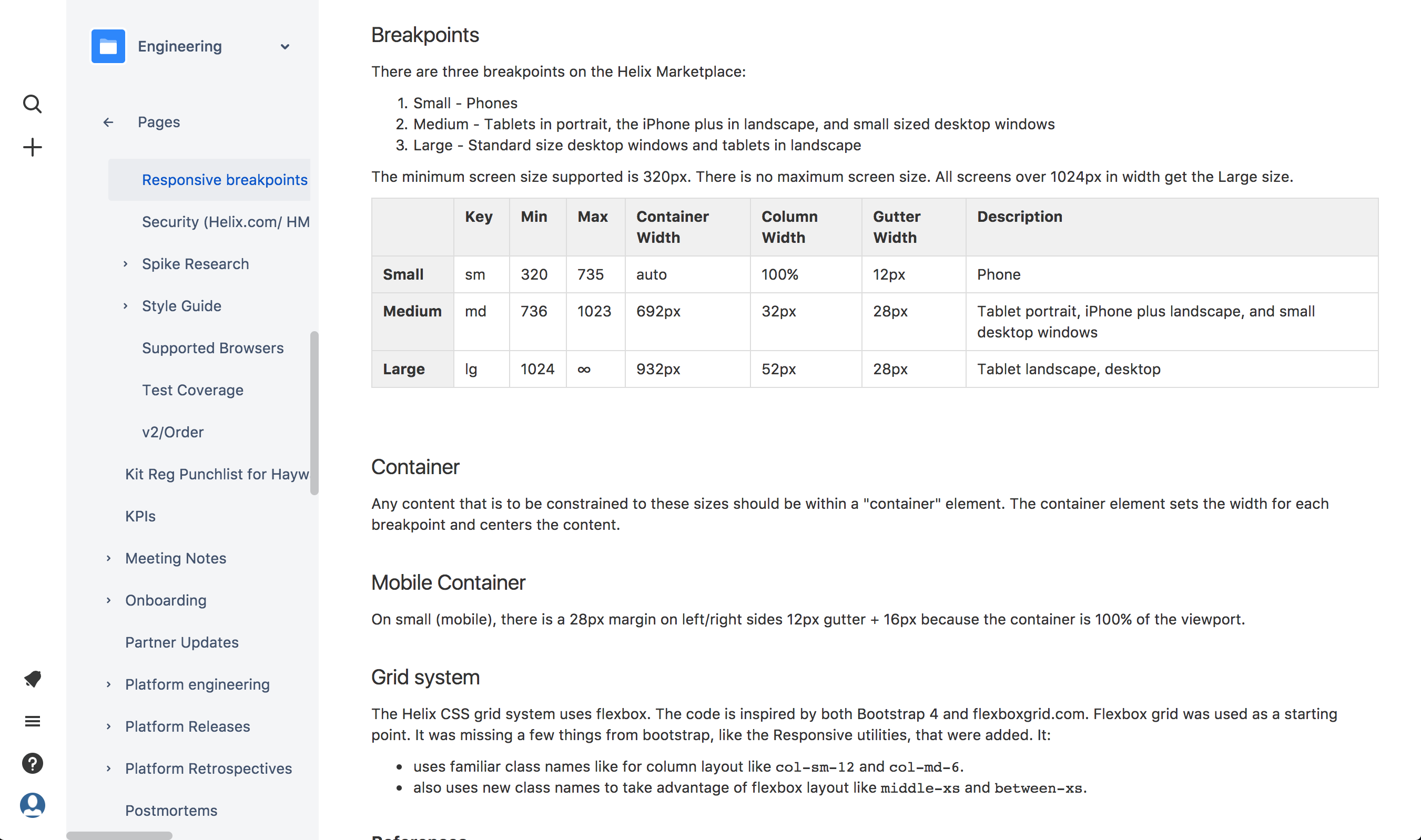
1. Looking for a satisfactory grid The first thing I felt needed clarification was the grid. We had an opportunity to replace everything we did at V1 with a more responsive grid system that will look great across all devices, orientations, and screen sizes (the new iphone and iphone plus sizes, ipads and ipad Pros).
I started to do some research and dug into the way it’s done on other sites. It was especially important that we work with a grid that’s divisible by 4 so that the site looks pixel-perfect across different screen densities.
We came up with this grid guide:
2. Style audit Together with Eli Block (the best intern I’ve ever guided), we went over every style and every component on our system and debated about what styles we should keep and what we could get rid of. To make our lives a bit easer, we used google sheets to document our answers to these questions:
- — Where is this pattern being used?
- — Is it being used more than once?
- — Can we live without it?
- — If we change it, will it still work?
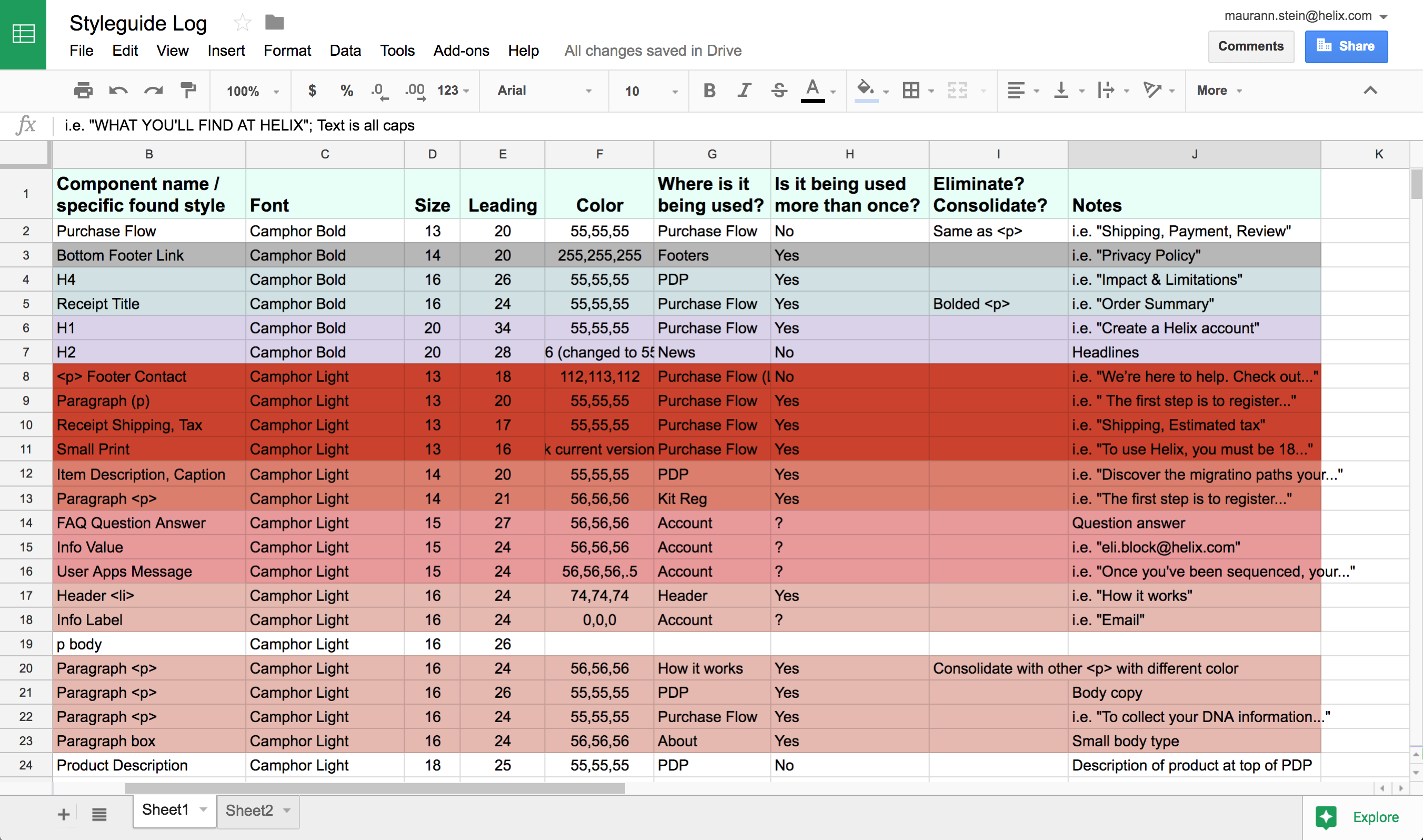
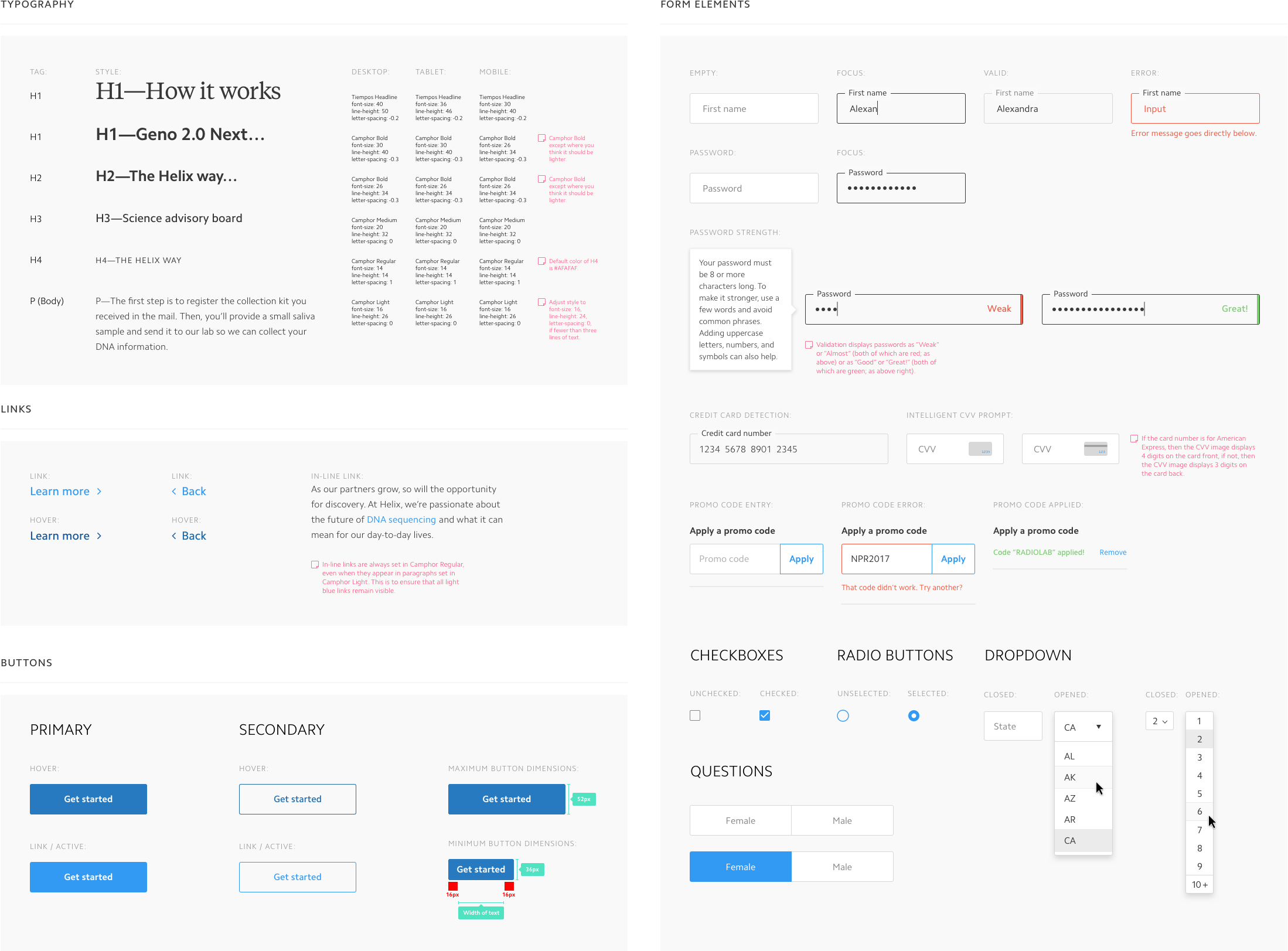
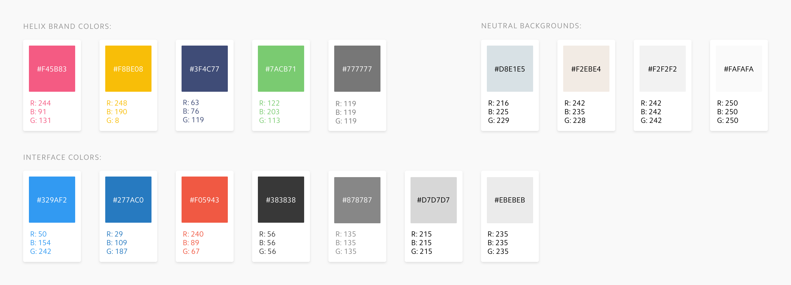
By the end of this exercise we were able to come up with a concise typographic pattern which we shared with the rest of the team. Then we continued to consolidate and establish the rest of the Helix component library—from links and buttons, to modals and form fields, and everything in-between.
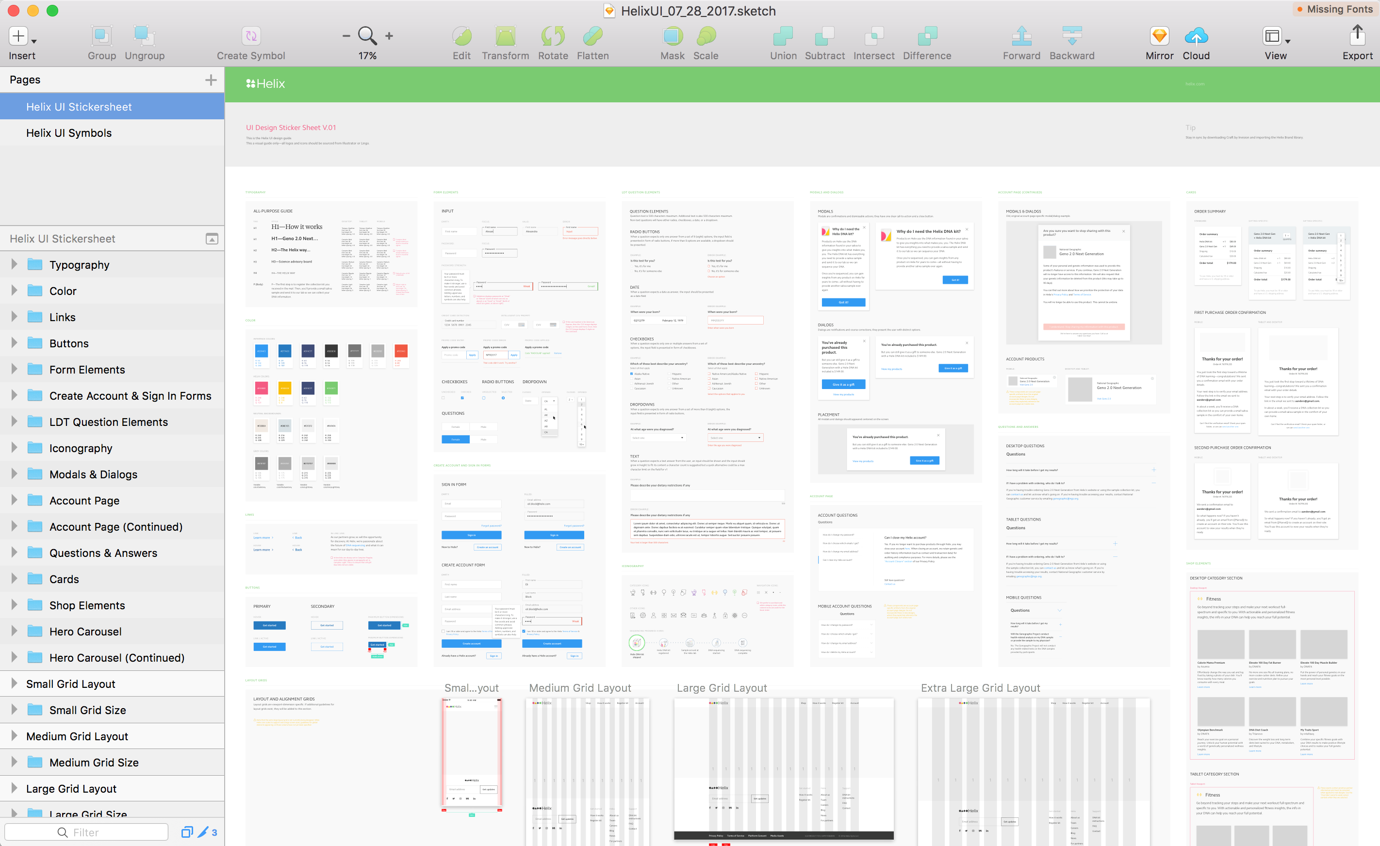
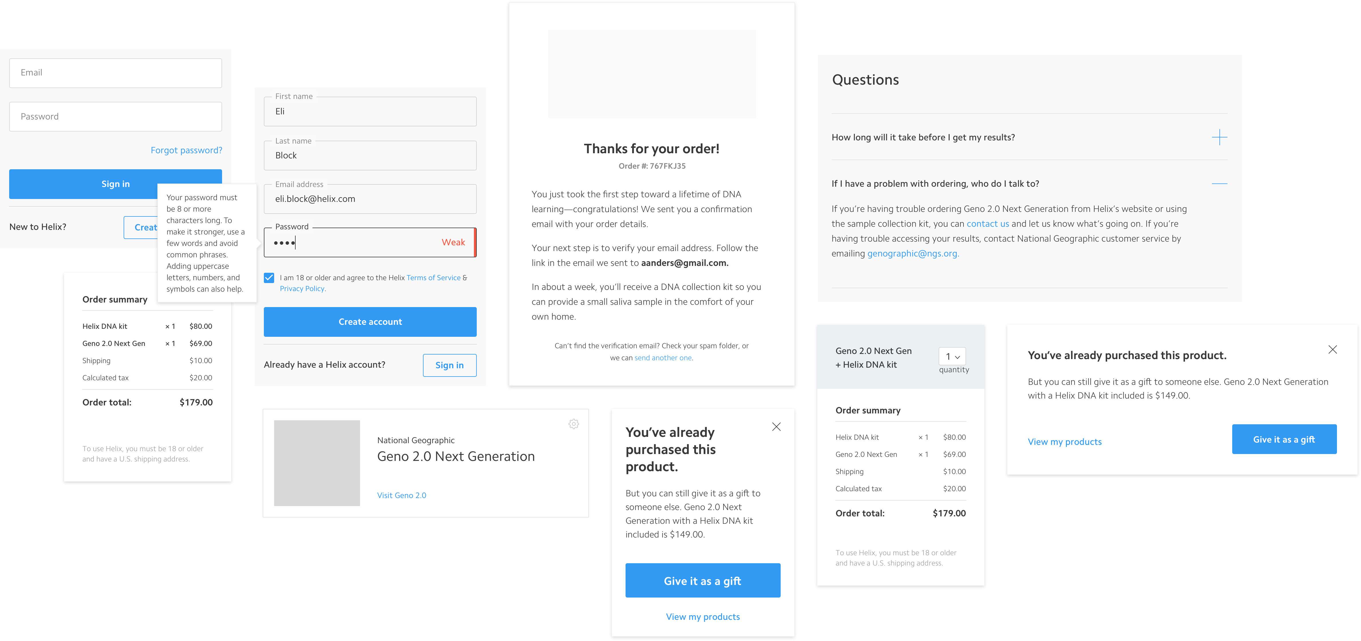
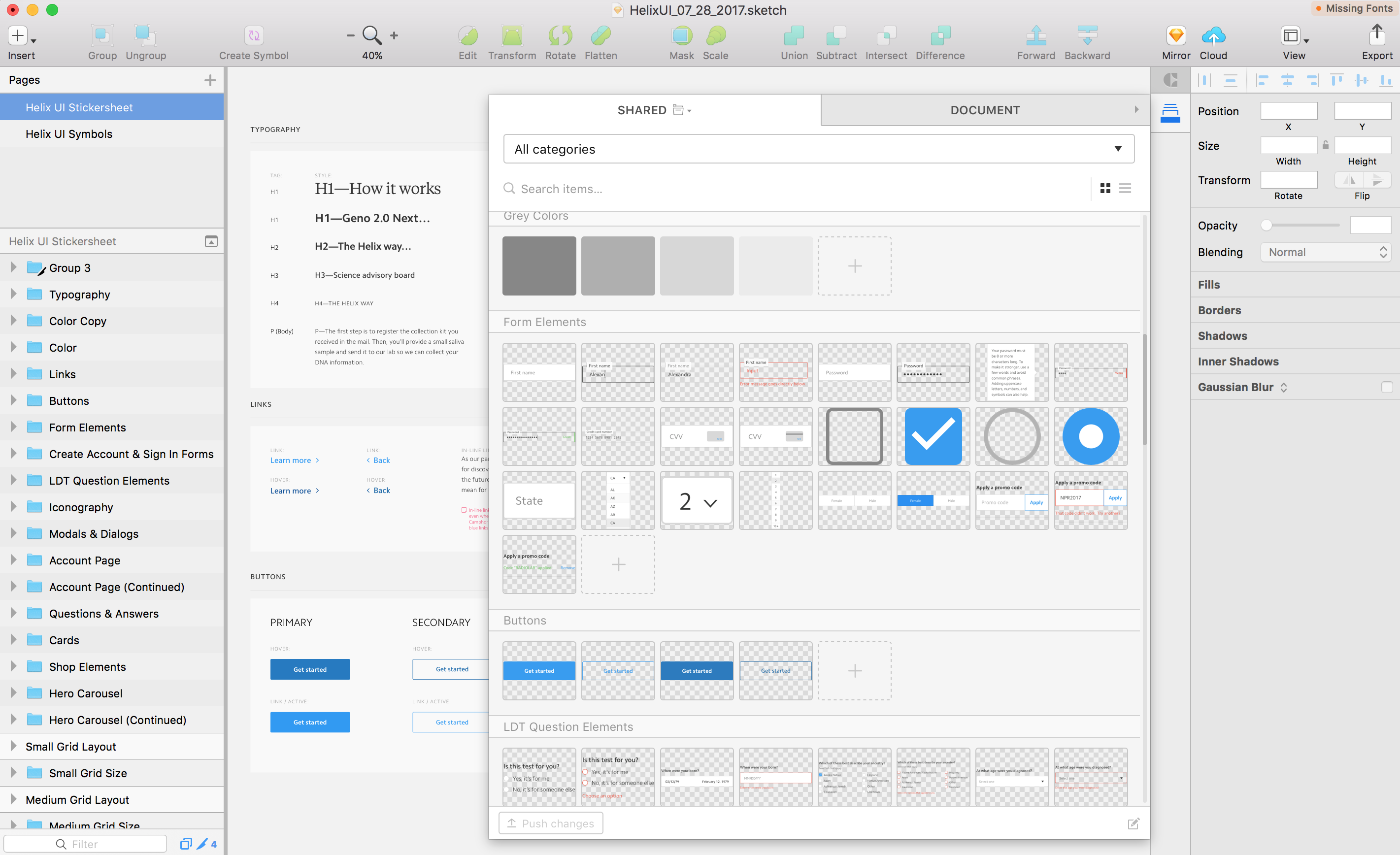
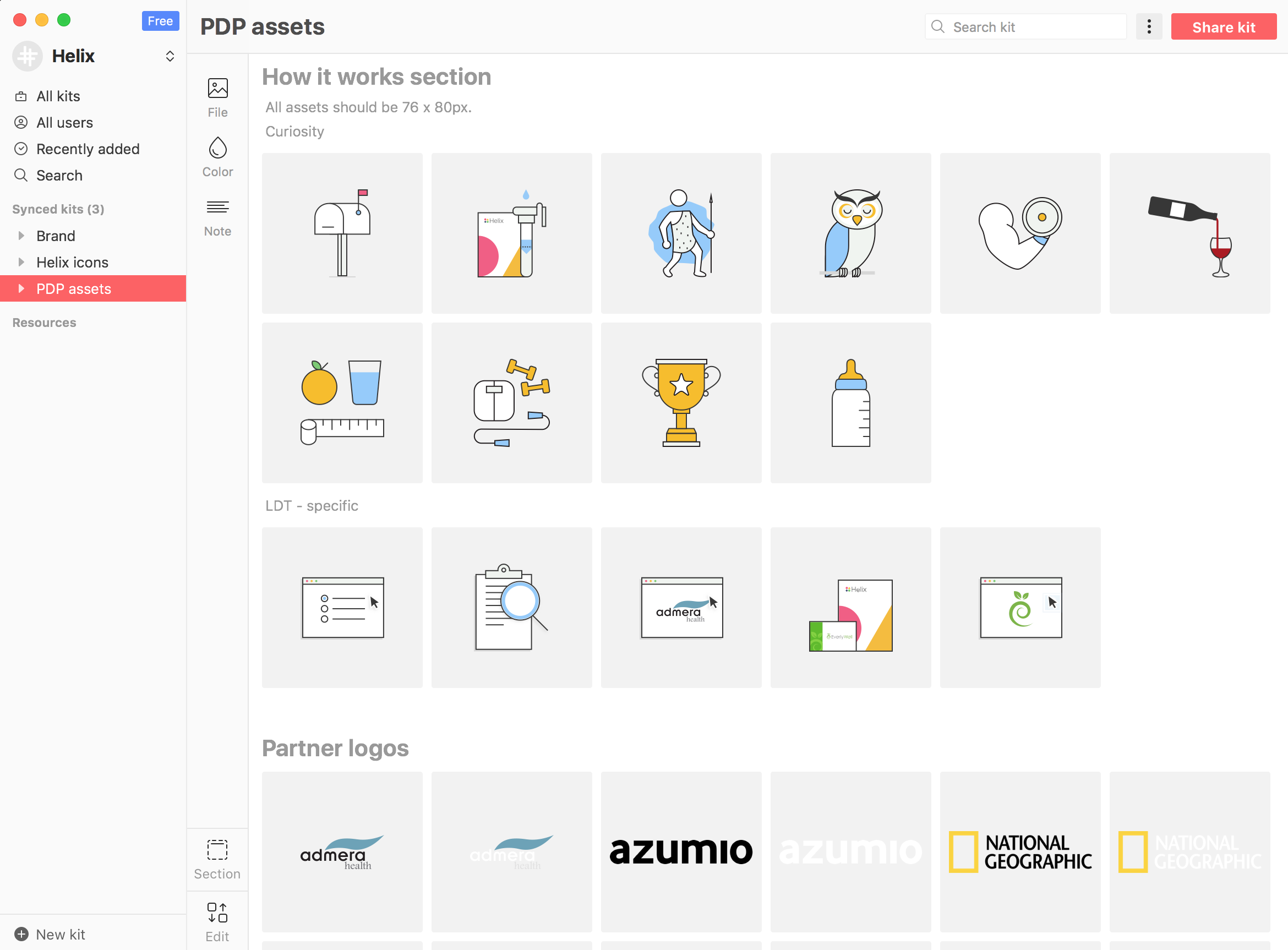
3. Creating components The really powerful moment happened when we took our shared styles, our atoms, and started to build molecules out of them, to later create the larger organism that keeps evolving. We documented what we built in the same UI library Sketch file, and shared with the team.
4. Maintenance tools Our next move was to look for the right tools that will help us manage this ever-evolving monster. Coincidentally, I attended Designer Fund’s Bridge program, which facilitated a design-specific knowledge share. That’s where I heard about Abstract, Lingo, and Craft from the founders themselves! I wanted to give it a try at Helix, so we started using Craft right away and poof! Everyone was working with the same styles.
BTW. We tried using Abstract but it felt a bit premature. We decided to wait until they solve the ”conflict“ situation better.
Results and next steps
Unifying Helix’s styles and design patterns set the foundation for a more effective use of time. The team is now working faster, and the engineers are finally able to focus on the important stuff without having to stop at least once a day and ask if we really meant #373837, or #373737 like everything else on the site..??!
Every component on our V2 app was corrected for consistency and quality, and we ripped out thousands of lines of CSS which sped the application up significantly. There’s still a lot of work to do, but we’re on the right track!
Thinking about the future of this endeavor, the next step is to build a component library for new engineers to browse through and build upon, and to define a set of rules for when and how to build a sustainable app.