Maurann Stein
Helix, Aug—June 2017
Balancing speed and accuracy
When redesigning the Helix chuckout flow, I had to work out a way to ensure users are buying the option that’s right for them, without sacrificing their need for transparency and efficiency, and without adding extra friction.
Here’s how I did it:
The goals
By launch, customers buying on Helix.com should be able to:
- Create a Helix account.
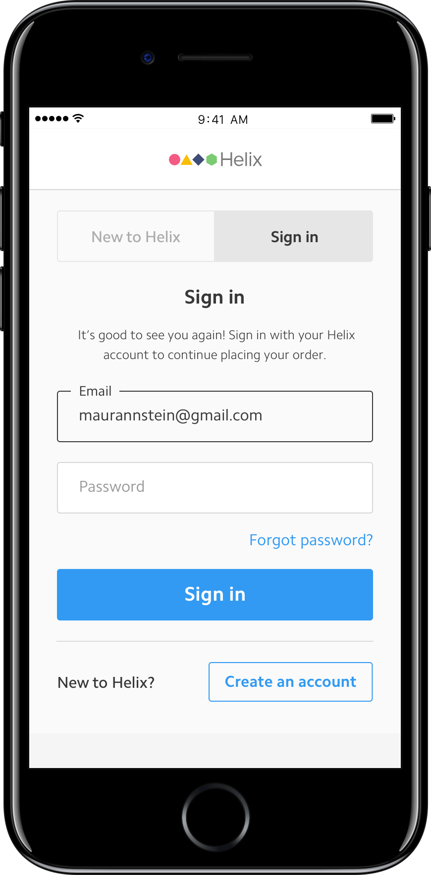
- Sign in with an existing Helix account.
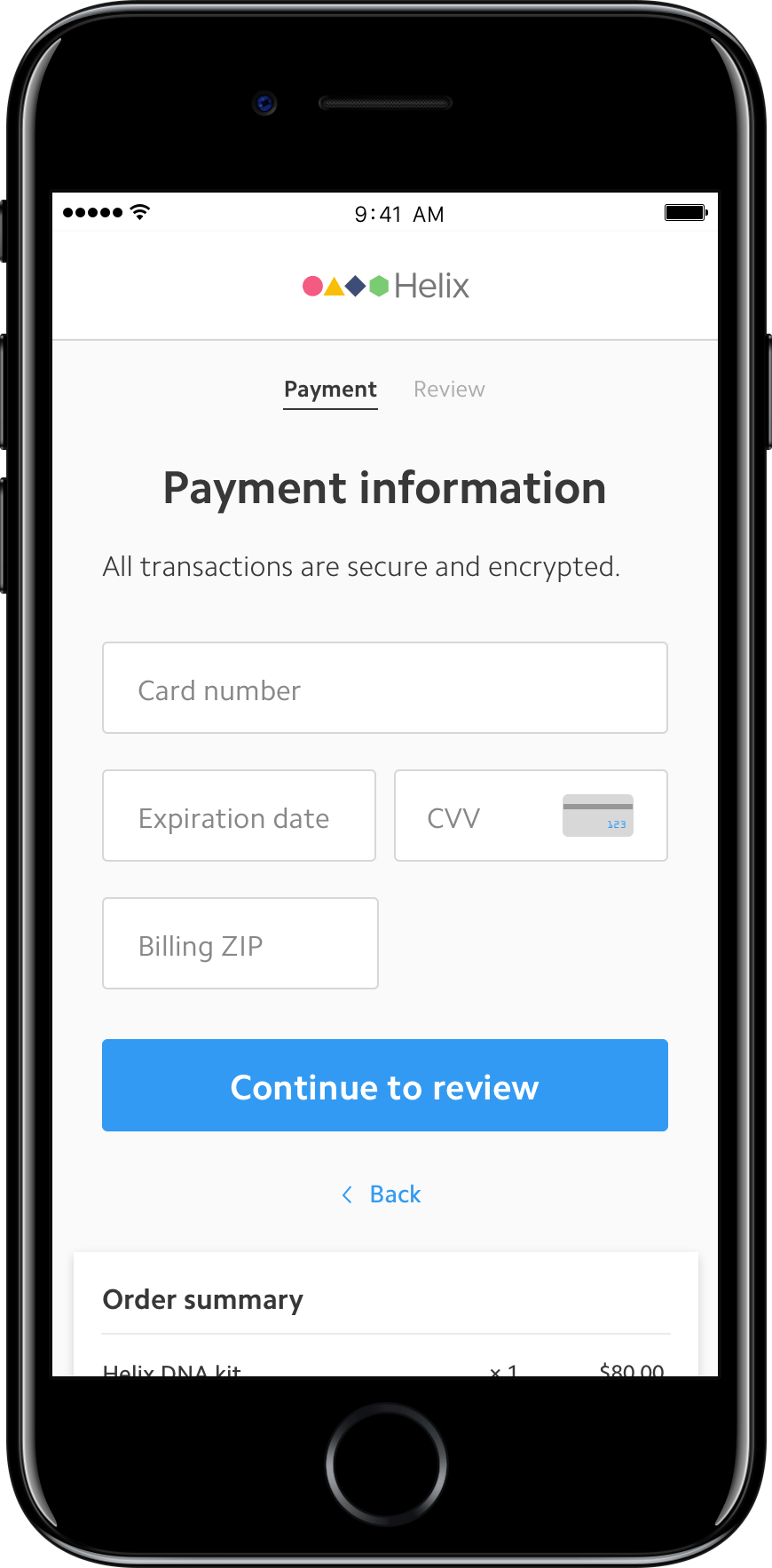
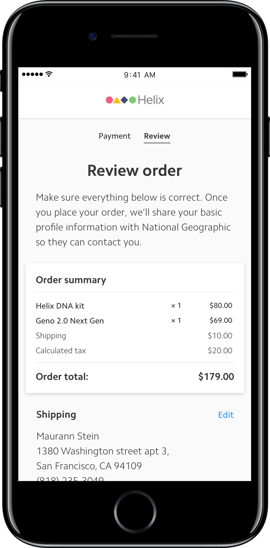
- Purchase their first product with a DNA collection kit.
- Purchase their second (and above) product without a DNA collection kit.
- Purchase multiple quantities of the same product as gifts.
The non-goals
- Design an entirely different type of checkout experience (e.g. accordion-style vs step-by-step vs single-page checkout).
- Allow users to purchase multiple apps during a single checkout experience (e.g. shopping cart).
My role:
1. The good concierge One of my main goals when designing the new purchase flow was to help our customers understand what Helix actually does. The metaphor that kept coming to my mind was that buying a first product + DNA kit is like getting a key that opens up the door to the Helix platform. But—once you have that key—you never need another one again. Instead of just explaining this concept with a short copy blurb (because we know no one reads), we baked the concierge into the customer experience.
We realized that in order for us to be the best concierge and open doors for existing residents or hand out keys to new ones, we had to first know who’s standing at the door.
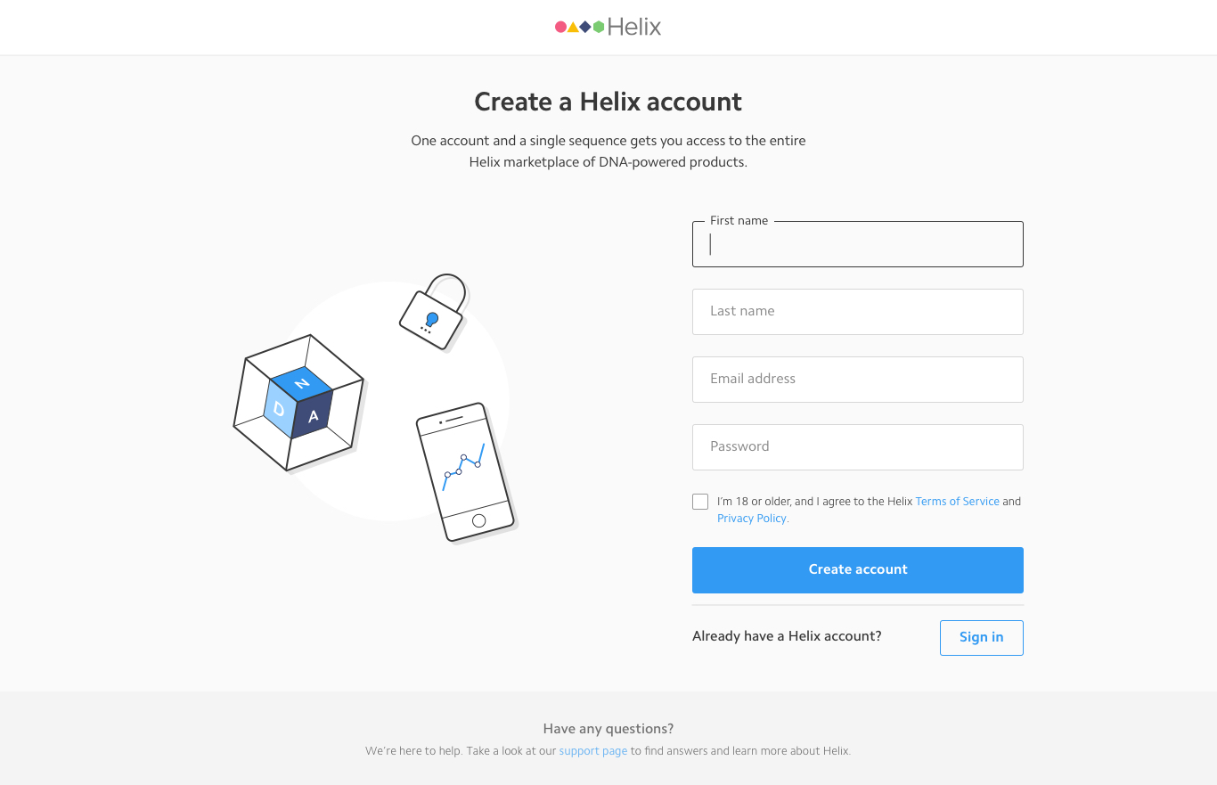
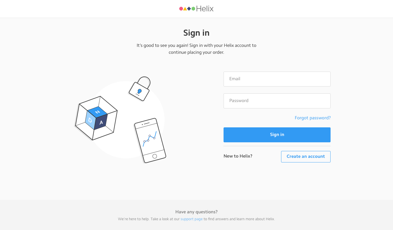
So if users select the option to purchase a product with a kit on the PDP, the next screen should prompt them to create an account—assuming they’re new to the Helix platform. And when users choose to buy just the product without a kit, we should direct them to the sign-in screen, to then make sure they’ve already been sequenced by Helix and don’t need another DNA kit.
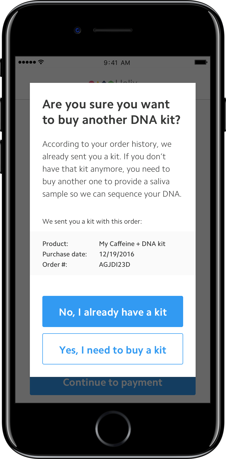
Identifying our users at the front door was just the beginning. The project got more interesting when we started to think how mistakes can be introduced and handled by our system. What if a user mistakenly chose to buy a product with a kit when they were already sequenced by Helix? What happens when users try to buy just the app (which is cheaper) when they’ve never been sequenced before? What if users purchased a kit before and want to buy another one, because they gave the first one away as a gift?
2. Course correcting our users To handle all the possible edge cases for having to purchase a DNA kit or not, we came up with several course correction modals that get triggered based on a few simple queries we make in the user’s account:
- — Does the user already own this product?
- — Did the user register a Helix DNA kit with this account before?
- — Did a user buy a DNA kit before?
Knowing the answers to these questions helps us lead users to the right flow.
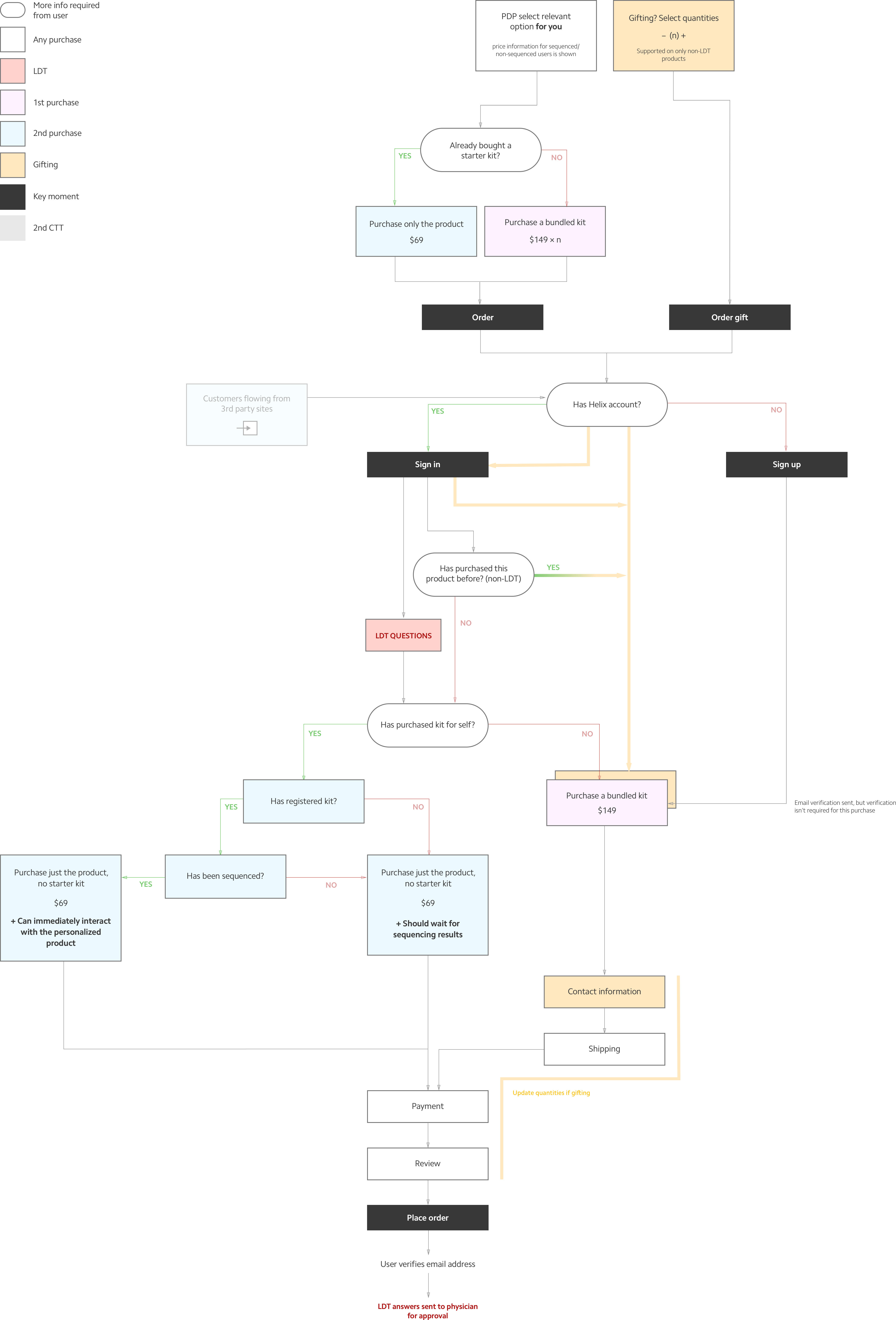
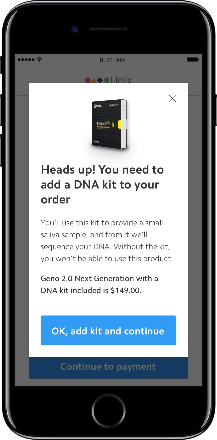
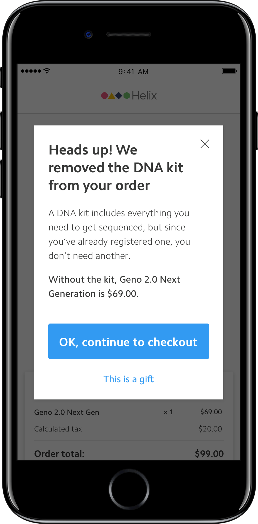
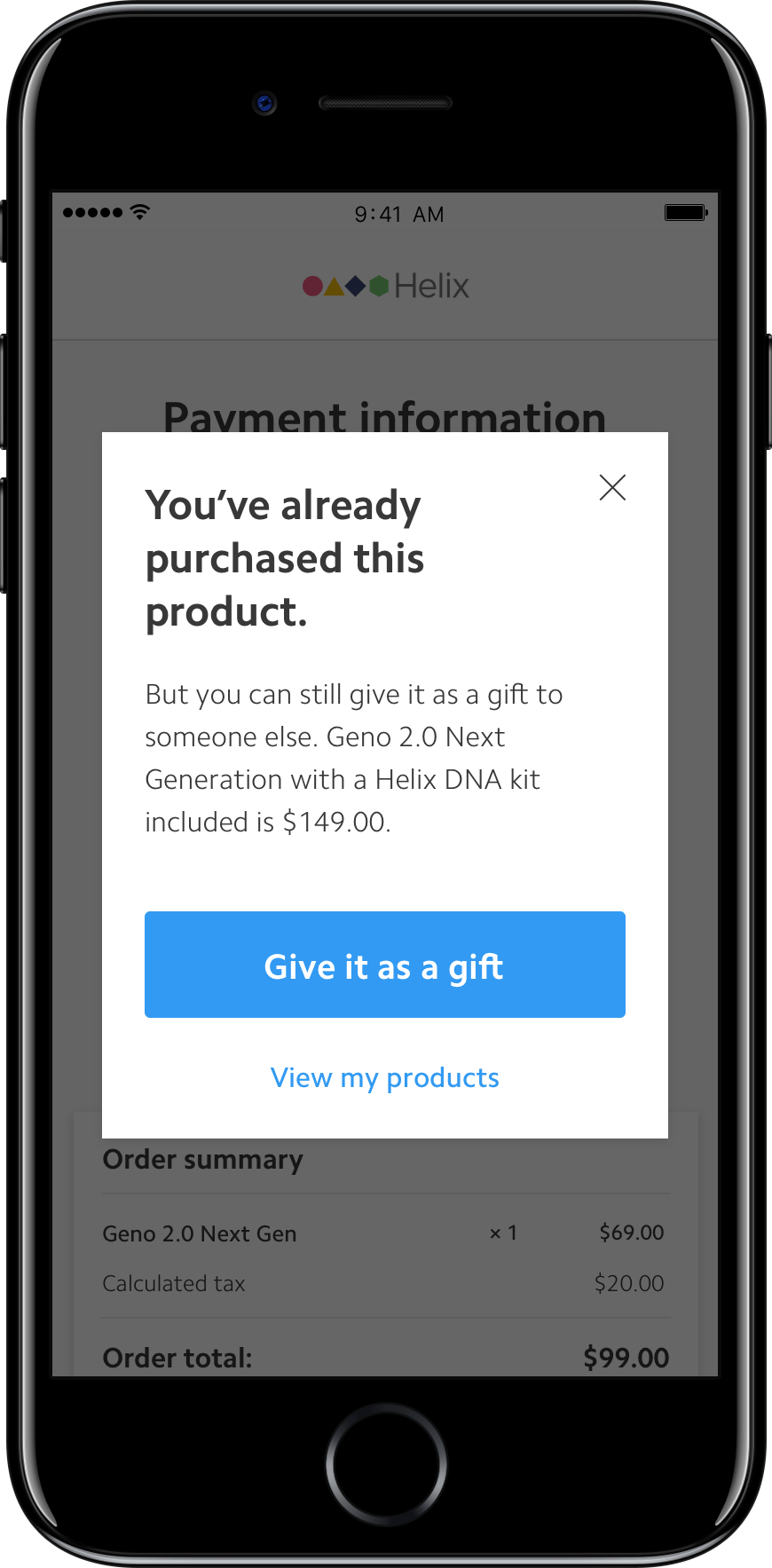
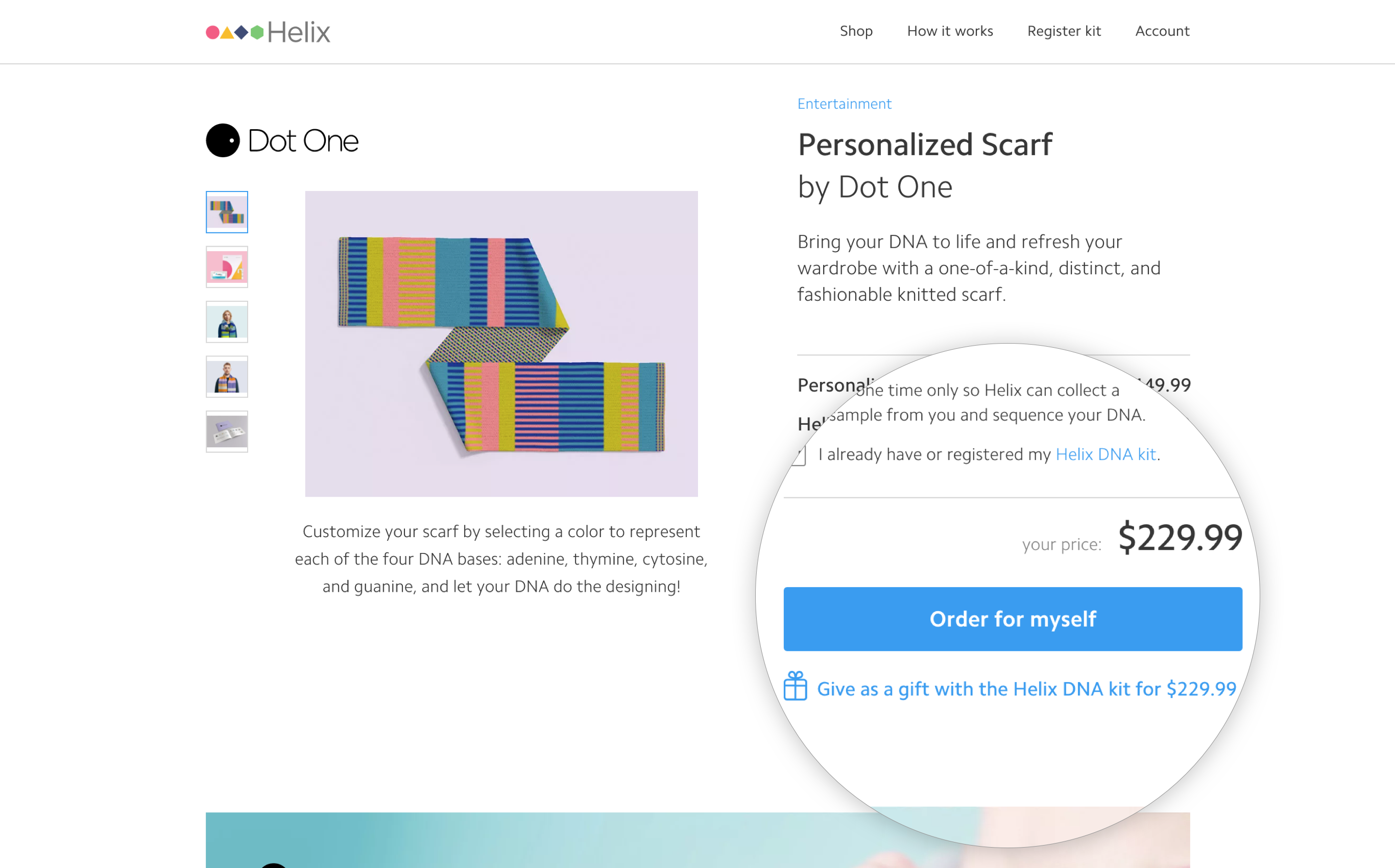
3. “Order for myself” vs Gift When I designed this flow, I tried to think of ways to reduce checkout friction while also dealing with the complexity of making sure users are purchasing the DNA kit when they really need to. Avoiding sending extra kits to users who have already been sequenced was a key priority, so we decided to focus on a single-purchase-for-self as the primary checkout flow, which requires account creation or sign-in in order to bring the course correction into play.
Except we didn't want to force our gifters to create a Helix account when they’re purchasing products for others. We decided to split up the flows: one route leads to an “order for myself” flow where the course correction kicks in. The second route leads to a gifting flow, where users can choose to purchase multiple quantities of the same product without having to create a Helix account.
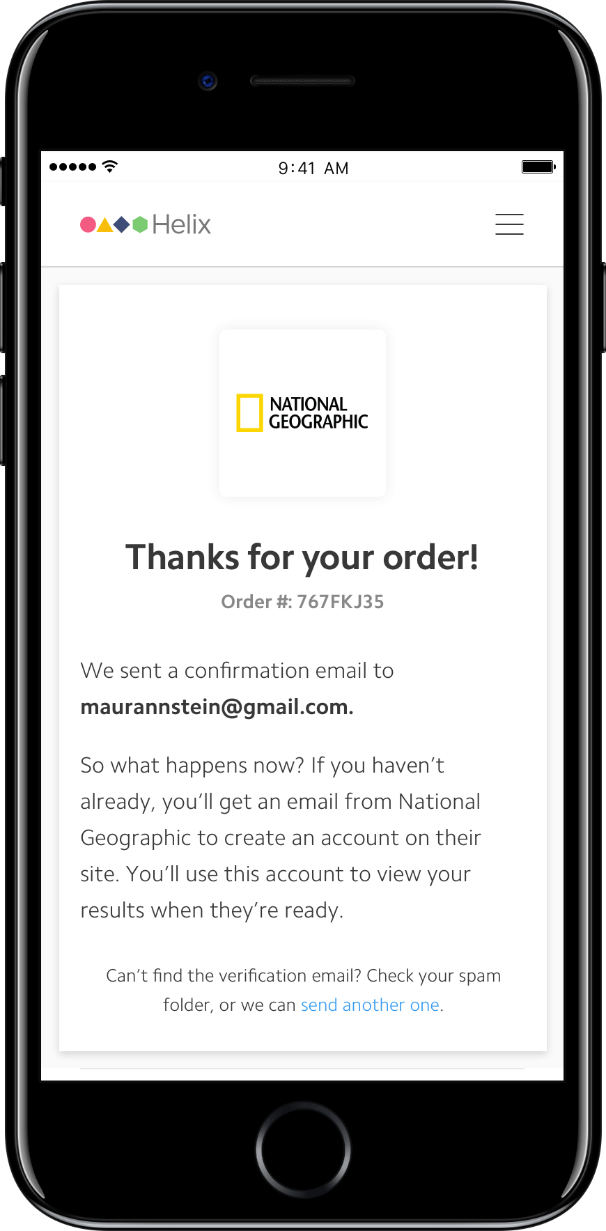
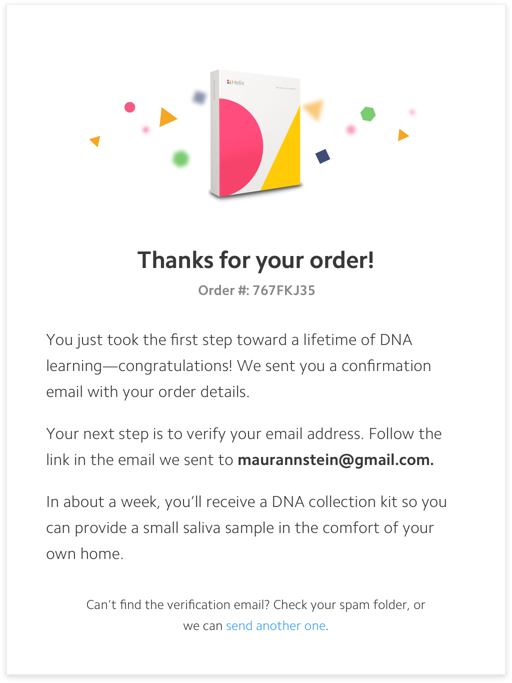
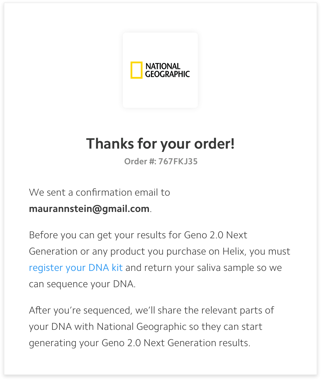
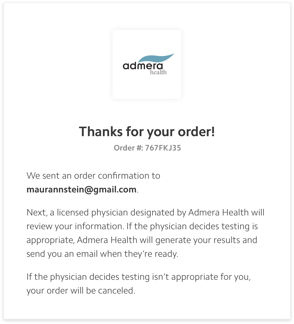
4. Tailored micro-copy Together with my good friend Luke, the UX writer, we concocted different moments of personalized messages throughout the system to keep users engaged and connected to the flow. It was especially relevant in the thank-you message at the very end of the flow, where we wanted to communicate different things to our different customers who just bought a product on Helix. There were several next steps that we had to get our users to take (such as to register their DNA kit, or to verify their email, or to wait for a physician approval) to get the most frictionless Helix experience going forward. So we wrote together 9 different thank you messages, each tailored to the user’s state in the system. Here are just three of them:
Results
Through this redesign, we built a foundation that will allow future Helix users to make the purchase that’s right for them, without compromising the user experience. We hope that our design decisions help clarify Helix’s “sequence once, query often” model, which is always a challenge to explain.
While it’s still early, we expect the purchase funnel to change due to the new create account/sign-in requirement. However, we also expect an increase in the number of people purchasing DNA-powered products and joining the Helix community.